It seems that the finer the details, the larger the trepidations. I think most designers enjoy the challenge of handling structural, mechanical and electrical aspects of new builds or renovations. As critical as these aspects can be, fixtures and finishes can make or break a space, none more than colour. However, paint selection can be the most difficult choice to make when completing a project.
Unless you are looking for that hot today, not so hot next week look, reckless abandonment is not the way to go. If you are looking for a palette that adds interest without being stressful, then the process should take on a little bit more structure.
Try to avoid rich or bright colours in large rooms. Rich hues can come across as being quite dark and gloomy while overly bright colours can be overpowering and can create stress in a room. If you cannot resist the temptation to go wild with colour, then try and restrict it to an end wall as an accent or focal point or perhaps in a foyer where it can be confined and managed in terms of impact and light.
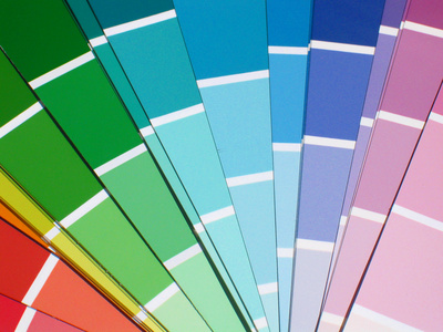
For best results, choose a good quality paint manufacturer. I like Benjamin Moore for ease of coverage and a great selection of colour swatches. The swatches are marked with a sun insignia for warm colours while a snowflake indicates stark or cold colours.
For a more soothing and fluid effect, stick to lighter, neutral colours which do not come across as being flash or trendy and will not tire over time.
Here are a few recommendations for colours I have used as solid choices. For a tried and true white, go with CC20 Decorators White. For a rich wall tone with a taupe-grey mix, try 2137-50 Sea Haze. If you are looking for an intense charcoal grey, try 2119-30 baby seal black.
Have design dilemmas? Please visit my homepage or email me at [email protected].
